I will always love when people onscreen use computers. It’s particularly nice when the escapism of movies and TV extends into the technologies the characters interact with—when we get a peek into baffling digital environments that complement unrealistic wardrobes, interior design choices, or entire plot lines. Weird little pockets of what computers and the web could be or could have been, before everything became the same 4 rectangles.
Sci-fi movies get a lot of attention when it comes to the interfaces they feature, which makes sense. All those bleep bloops. But many of my favorite interfaces come from movies and shows where the tech isn’t really central, more of a quick-fix plot device you shouldn’t think too much about. So obviously we’re gonna!
For the purposes of this list, I’m defining “fictional interface” as either:
Some crazy shit the production designers cooked up for fake tech or
Any real-world interface adapted/misused in a work of fiction
COMPUTER: START LIST.
The Lizzie McGuire Movie: Better version of Yahoo! Music
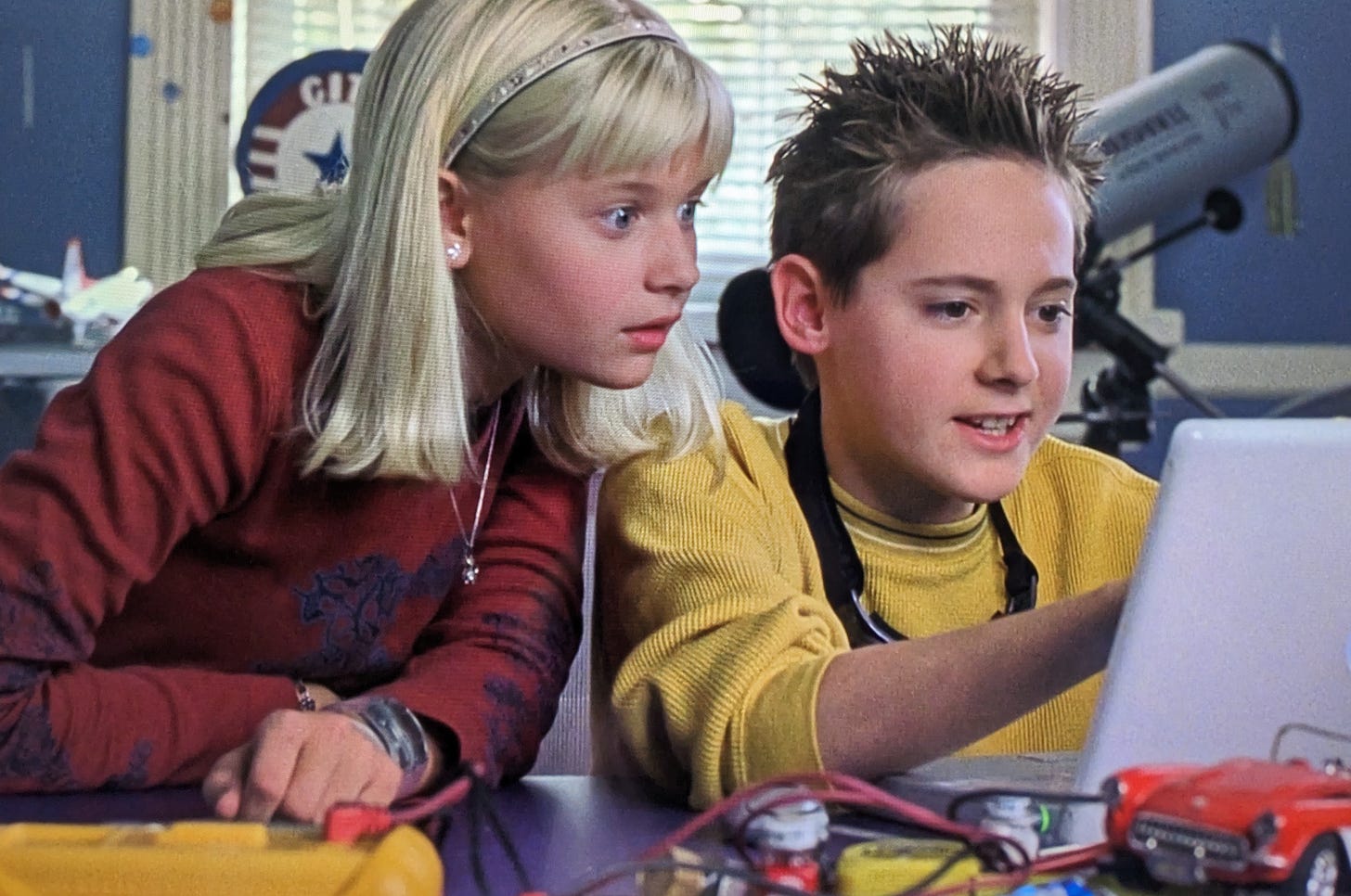
This movie is goated, for several reasons outside the scope of this post. But the side plot with Lizzie’s younger brother and his evil girlfriend perfectly captures the everyday intrigue of doing Computer Time at your Friend’s House:
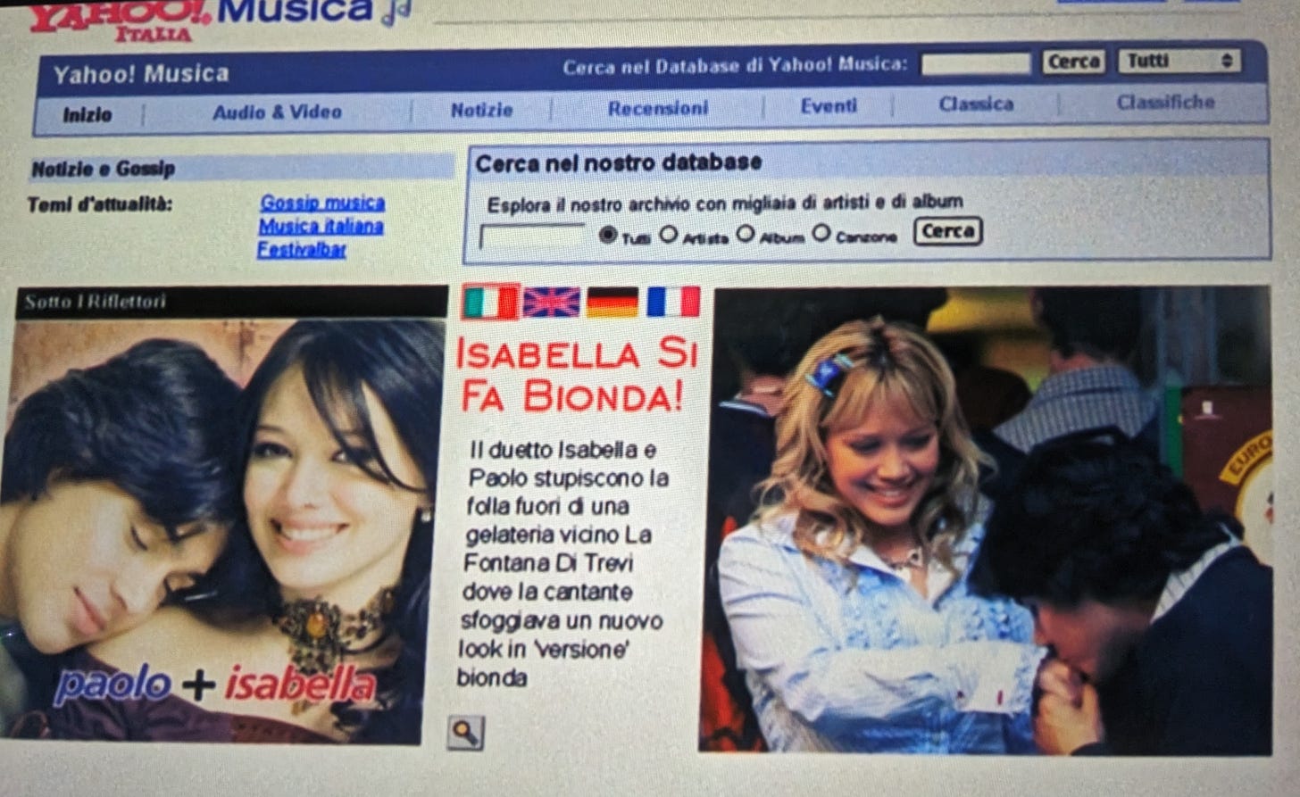
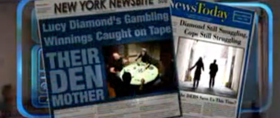
Mixed with the sheer drama of finding your sister mistaken for a celebrity on an Italian news site:
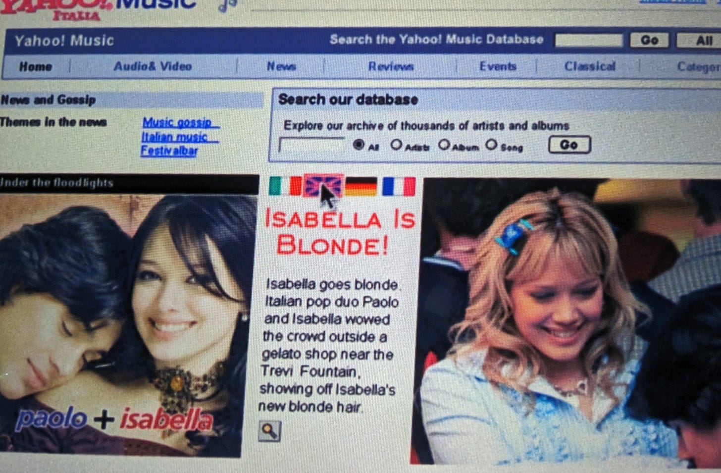
Which you can translate to English with the click of a button to get your sister in MAJOR TROUBLE WITH YOUR PARENTS:
I appreciate both the attention to detail here and the idealism of a truly global web. Supporting modular updates in 4 languages would require content systems that were almost surely beyond us, and definitely beyond Yahoo!, in 2003.
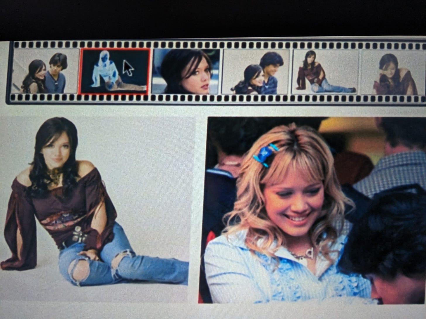
Finally, I love the site’s image viewer, where you can browse photos via a little film strip, and the thumbnails you click turn negative!
Past Lives: Skype
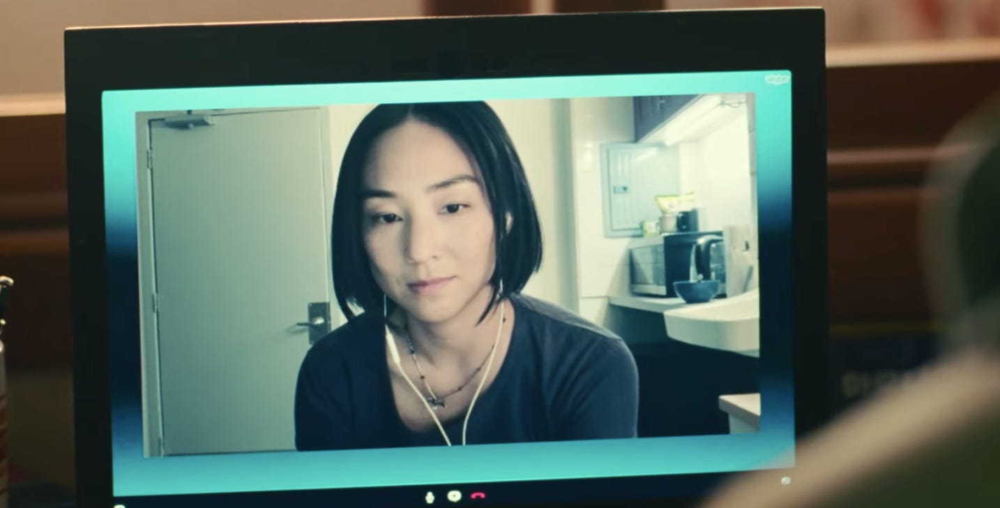
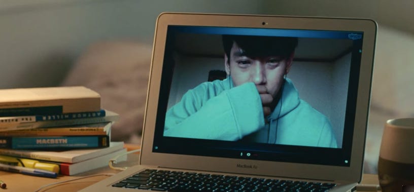
Past Lives is the best movie about crying I’ve seen in a long time. Here we’ve got childhood friends attempting to reconnect despite imperfect communication tools, blown-out lighting, and a whole lotta trauwma.
Skype is of course real, but the Past Lives 2010s version of it is much more minimal than it was in the actual 2010s. However, the result feels realistically intimate and centers that video-chat longing in a way that hurts so good.
The earbuds. The audio. This exact model of laptop. The intermittent freezing. The webcam quality that basically became this generation’s version of vaseline on a camera lens. I’ve done my fair share of wistful Skype recon and LDRs, and the vibes here ran me over, and I said thank you, again please.
D.E.B.S.: Dinervision
The main thing about D.E.B.S. is that it does not give a fuck. There are so many things in this film that I will never have answers for, including but not limited to every single use of technology. And it is such a gift.
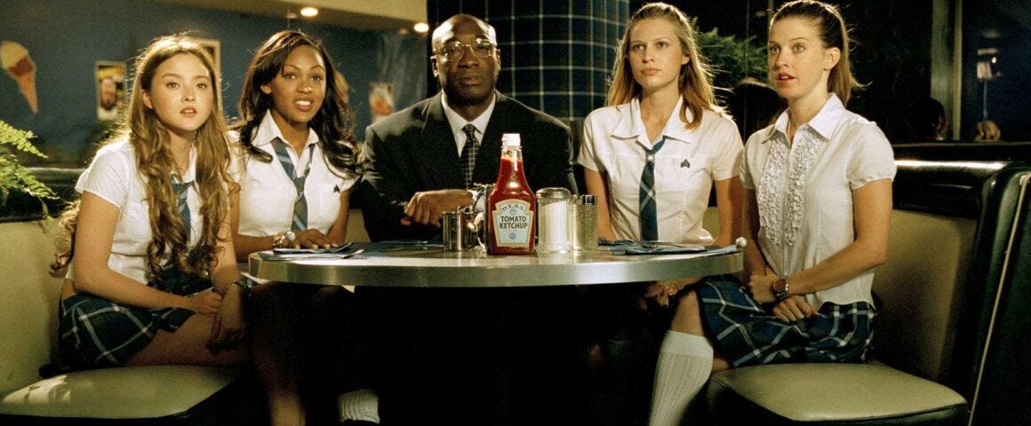
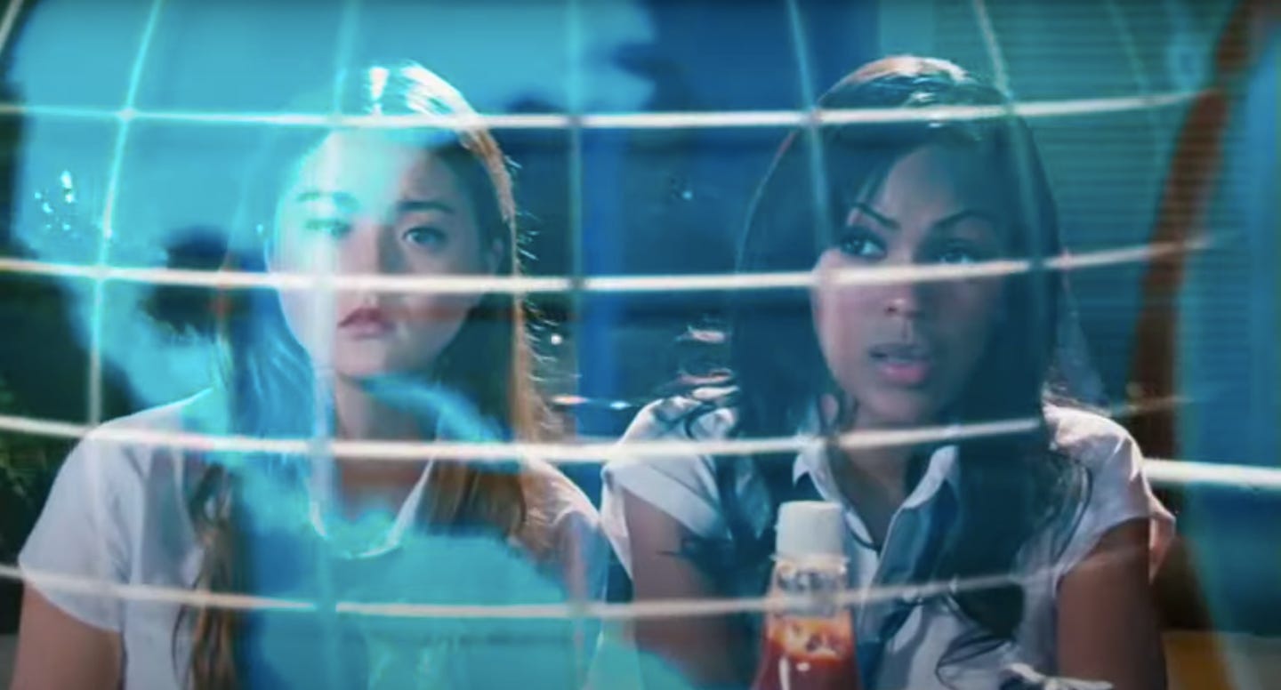
I’m calling this specific instance “dinervision” because I don’t know how else to describe this sequence of events:
The main D.E.B.S. enter the crowded lobby(?) of the school for D.E.B.S, which is inexplicably a diner(?)
They sit at a booth complete with a bottle of “D.E.B.S. Tomato Ketchup.”
A waitress(?) attempts to take their order.
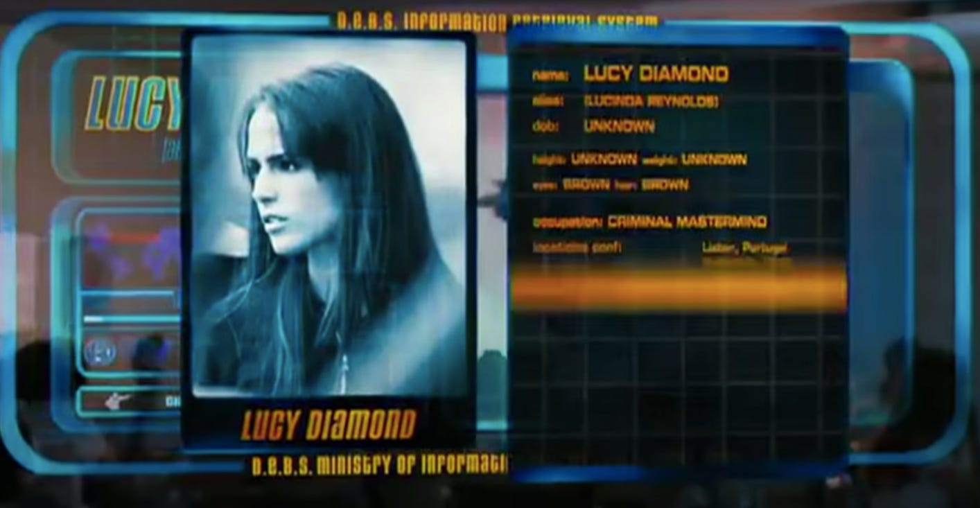
Their boss somehow reveals unto the D.E.B.S. a dossier of highly classified information in the form of a giant hologram right in front of their table.
Documents start to spill out of the hologram, creating a zany pastiche.
The D.E.B.S. are prepared for their mission!
I’m honestly not sure this one even counts as an interface. I don’t remember anyone actually controlling anything. I think this projection just kind of happens to them.
Whatever! Still rocks!
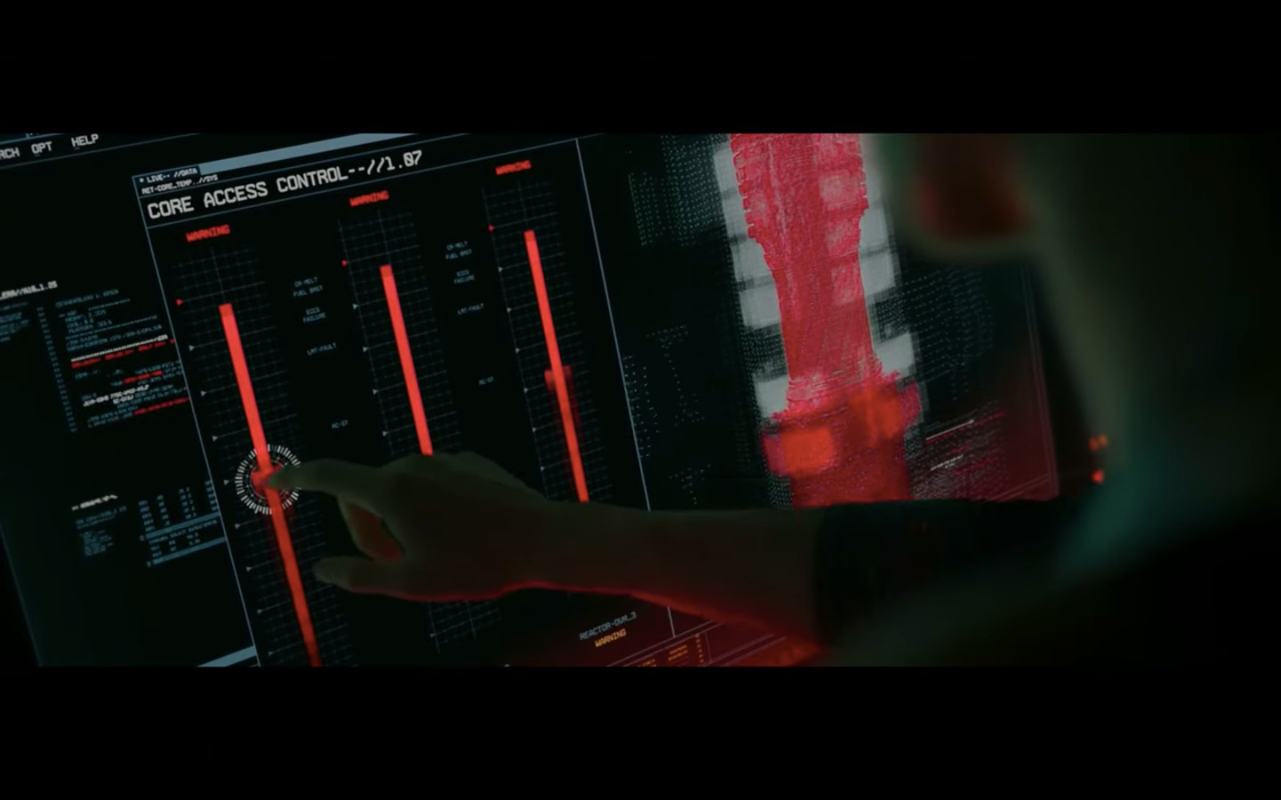
Underwater: All the bits and bobs
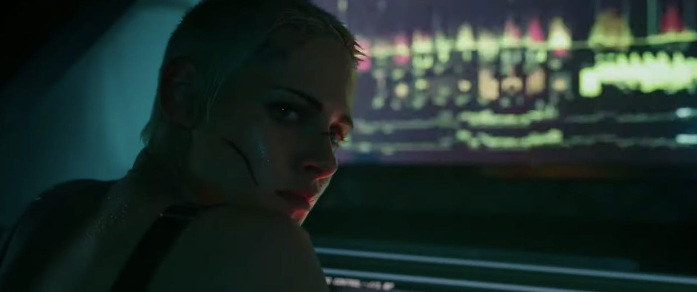
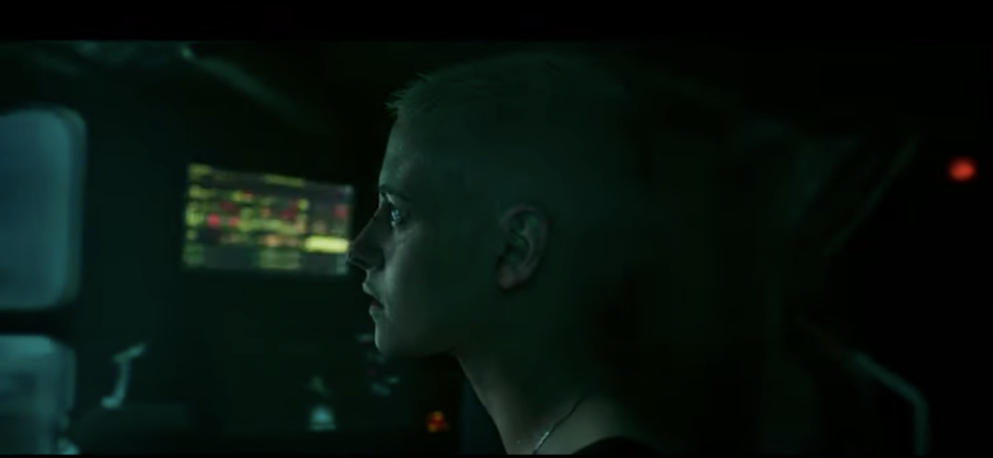
Underwater is a movie about what if bisexual lighting was red and green. All that glowy tech on the walls of Kristen Stewart’s isolated submarine does wonders for both her complexion and the overall ambiance of being hunted.
As far as the interfaces themselves, there’s a nice mix of glitchiness and oversimplified Spy Kids aesthetics.
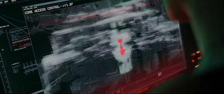
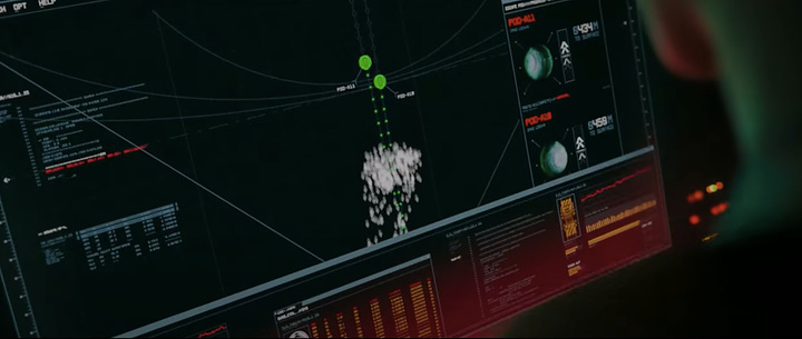
And I particularly appreciate the ease of swiping to self-detonate.
Usability slay!
The Holiday: Home swap app
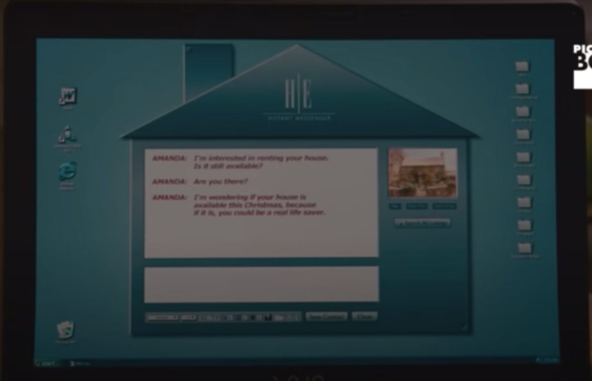
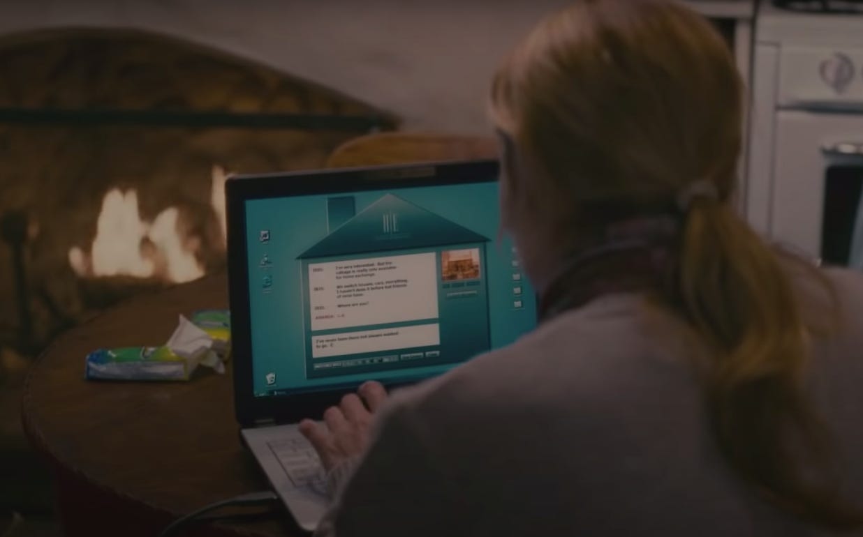
My all-time favorite. I think about this house chat thing daily. This staunch little tool helps our two smokeshow protagonists find intercontinental love and gumption, allowing them to cosplay as Little Miss Hollywood and Cottagecore Wretch, respectively.
My concerns:
What is it? We’re clearly not in a browser here. Is it an app? How do you close the window? Is it irrevocably baked into your desktop?
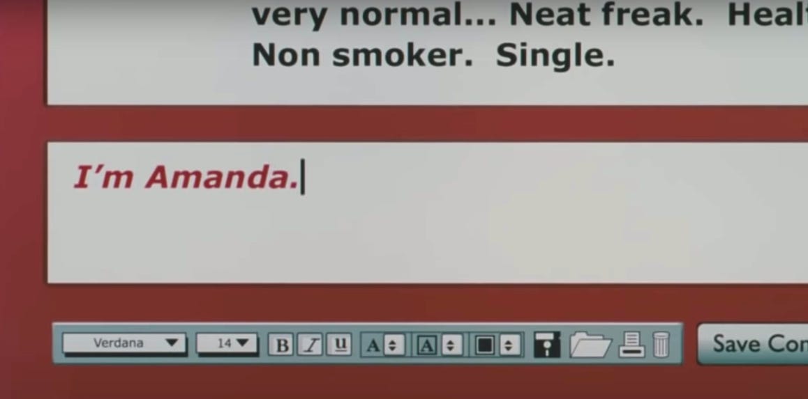
What does it know? It’s apparently different colors for different users, and may or may not match your desktop color. There’s no visible settings/customization option, so either it’s randomly assigned (chaotic, iconic) or advanced enough to learn from external graphical elements (also iconic).
What does it look like when you’re not chattin’? We see the one thumbnail on the right during chat mode. Are there more? What does a home swap listing look like? Does the whole outline of the house fill up with thumbnails to evoke a dollhouse? I sure hope so!
I imagine this app has a mysterious, vice-like grip on these machines, à la Chrome. Useful yet unforgiving. Omnipresent.
There is also no need to tell your basically-Airbnb host that you are single.
Victorious: TheSlap
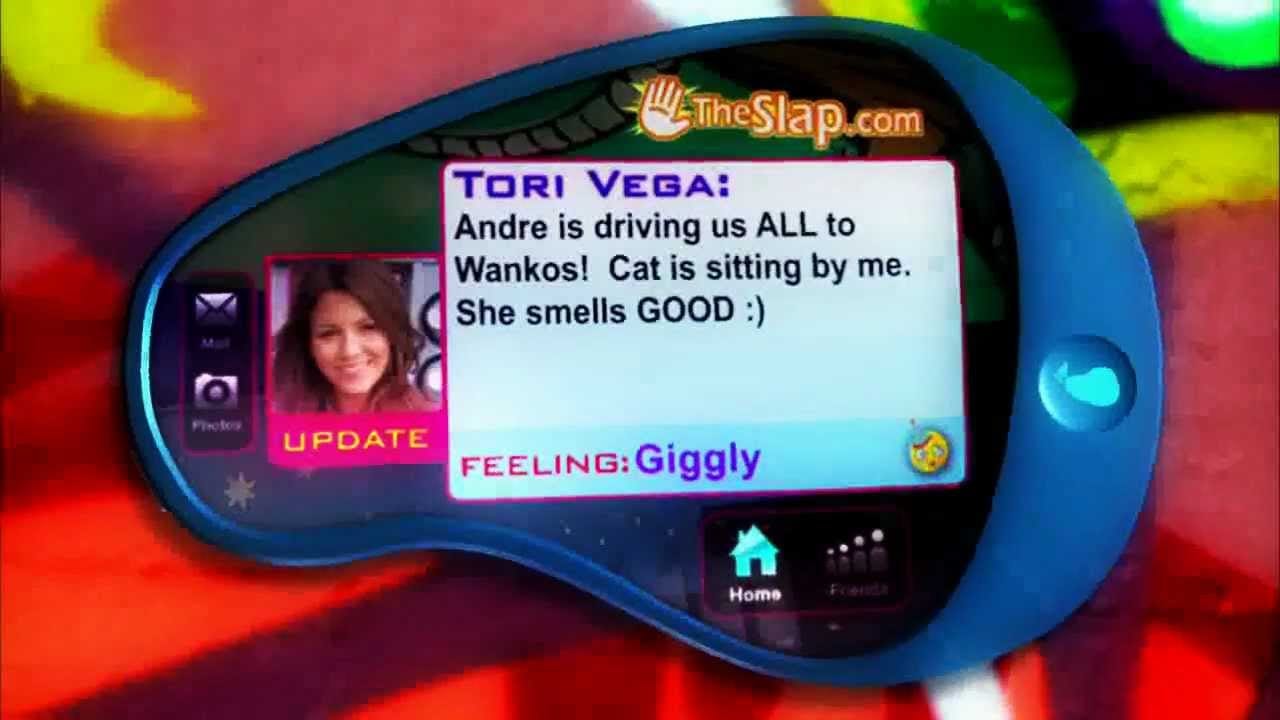
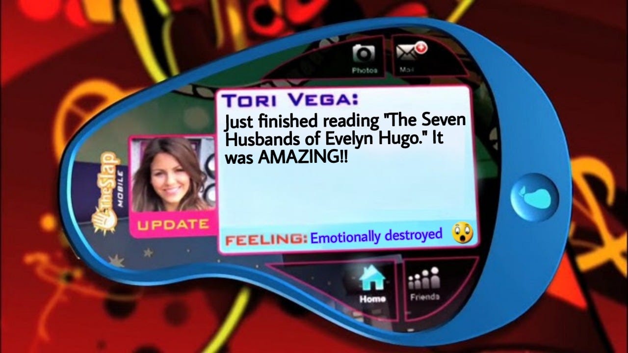
The Nickelodeon Pear Phone was the stuff of dreams, even if this Twitter analog was cringe from the jump. It’s funny that we’re still leaning so hard on rectangles here though, despite the blobularity of the hardware.
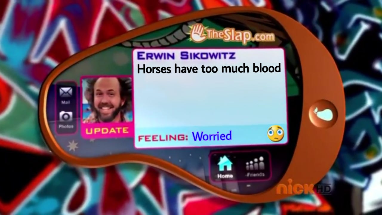
An “UPDATE” banner under appearing under your profile picture when you post is bizarre and fun. Also, the implication that this is somehow a website in a browser (“TheSlap.com”) and not a phone app once again reveals our glib refusal to have anything make sense.
I also like that this one became a mediocre meme template with time.
The Devil Wears Prada: Andy’s phone
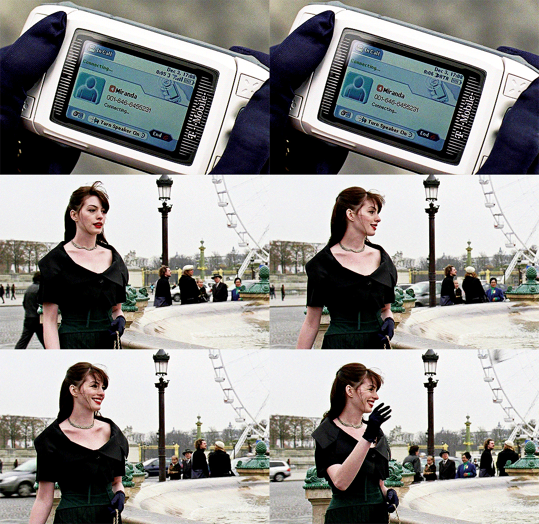
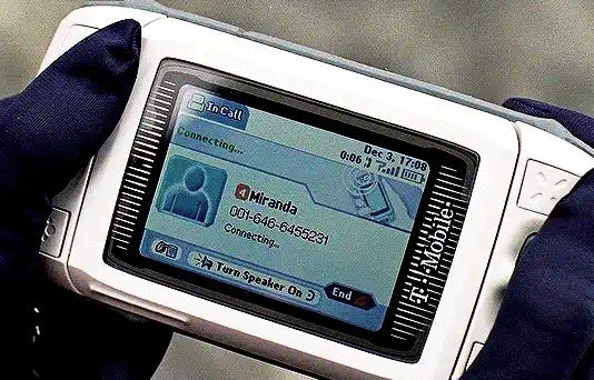
Andy’s big character-growth moment at the end of this fashionable slog of a movie is receiving a call from her boss on her slide phone, giggling in the wind, and throwing that sucker into a fountain at Place de la Concorde.
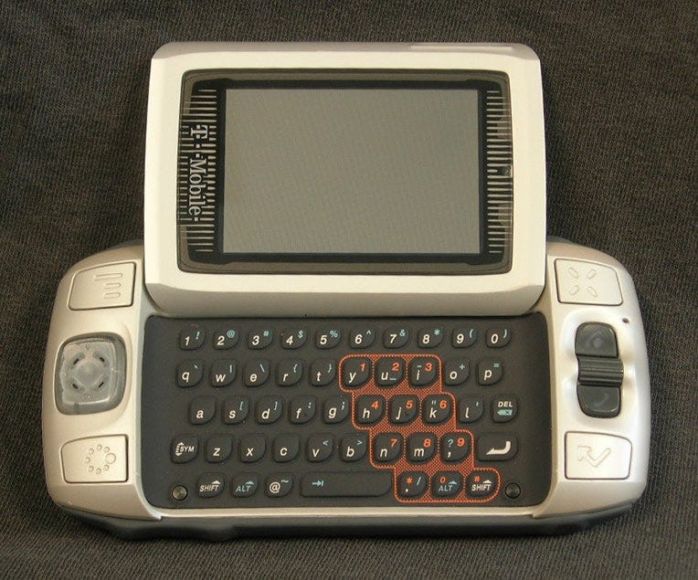
First of all, props to the filmmakers for yassifying the T-Mobile Sidekick, which usually looks like this:
A little spit shine and a gold chain go a long way here. But let us not get distracted: as far as I can tell, none of what’s on this phone screen makes sense in the context of somebody calling you and you not picking up.
“In Call?” An icon showing the phone unfolded when it isn’t? “Connecting…” in 2 places? 0:06 elapsed time of some sort? I don’t know what to tell you. The Devil Wears Prada aims for realism of appearance but absolutely non sequitur functionality. It is the inverse of D.E.B.S. in this way.
Relatedly, if this were made now, they probably couldn’t get away with showing the protagonist dispose of an electronic by tossing it into a famous attraction as an expression of triumph. But Andy sucks, so this behavior is fitting. No notes.


